creating a
Baggage Control Room GUI
Summary
Design and implement the user interface for the VIBES baggage handling system
| My Role | UX Designer | UI Developer | |
| Aim | To create a user interface for the new VIBES baggage handling system | |
| Challenge | Create a user-friendly UI with little UX processes in place | |
| Start | 2011 | |
| Duration | 7,5 years | |
| What I did | Interaction Design, UI Development, being a UX advocate | |
| Tools |
The story
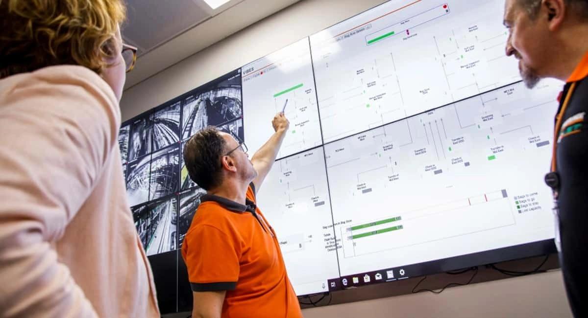
Vanderlande started development of a new generic software platform for baggage handling around 2010. This platform, to be called VIBES, should be usable for all airport types from small to large (these have very different baggage handling operations). VIBES was to include several user interfaces for workstations placed in the baggage handling area itself, and a user interface for use in the Baggage Control Room (the BCR GUI). From this Baggage Control Room, operators use this user interface, amongst other products, to monitor and control the baggage handling process and to plan flights. Development of the BCR GUI was done in parallel with development of the VIBES backend software.
The problem
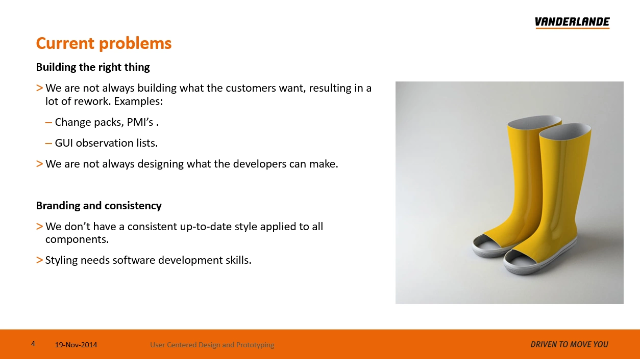
Vanderlande is a company with a passion for technology and it developed products based on what it technically possible. Usability and UX were not known forces in the company when development of VIBES started. In fact, when I joined, as a front-end developer, I looked around in astonishment, asking "where are the designers?" UI designs were mostly made by software architects or component owners, based on requirements and the technical possibilities of the VIBES back end software.
The project
The BCR GUI consisted of a GUI Framework that supplied styling and common functionality for the application (like logging in, help, main navigation, etc.) and 'components' that supplied the content of the UI. There was a component for operation monitoring of the baggage handling system, a component for flight planning and one for reporting and analysis. These components were developed by different teams at first. Later the first two teams merged. On average, each team consisted of 2-4 back-end developers, 2-3 front-end developers, 2 testers and a product owner. I stayed on the project for 7,5 years.

The process
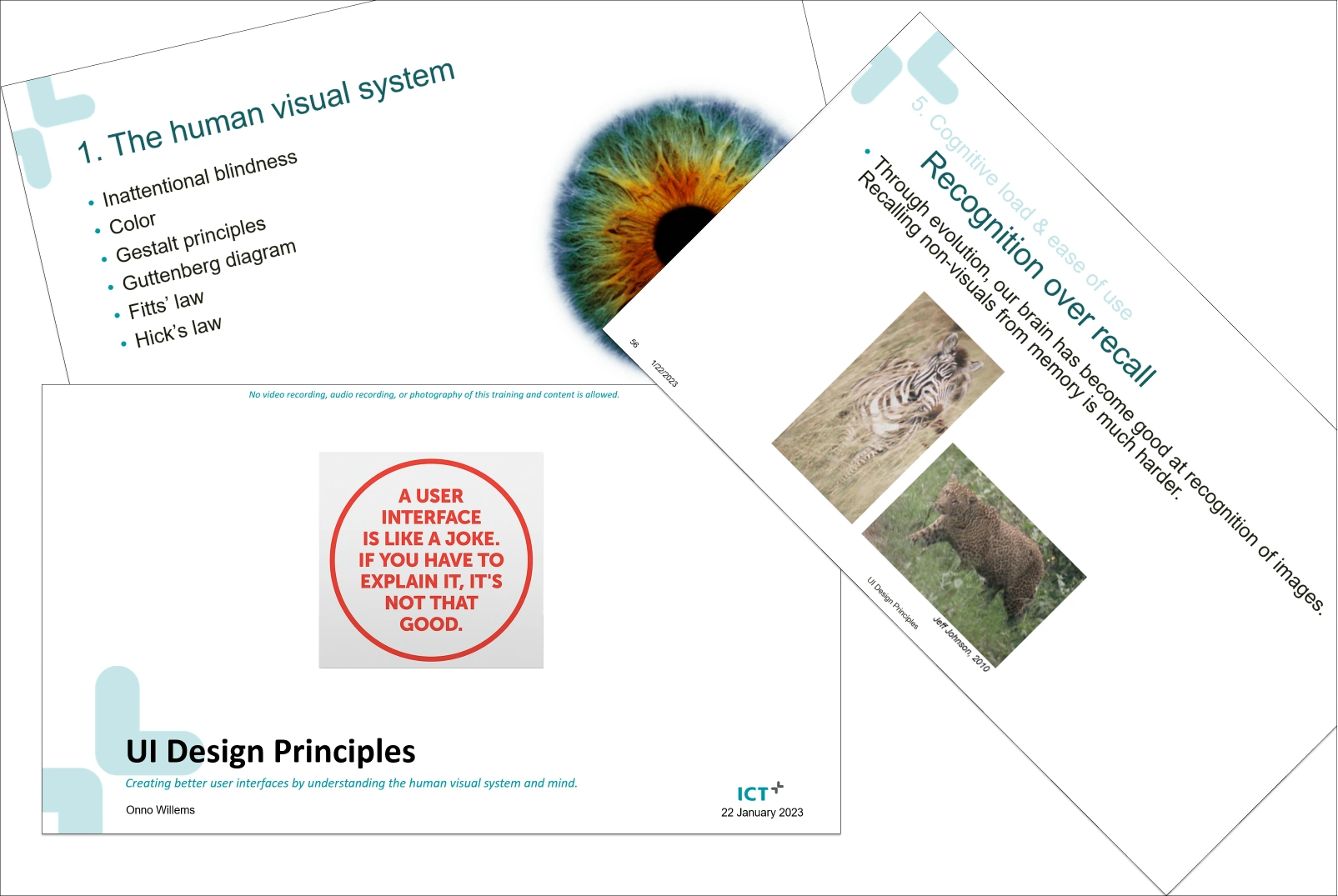
I started as a front-end developer, implementing proposed screens in C#, WPF/XAML with the MVVM design pattern. I worked closely with the product ower and domain experts and soon started to advocate the importance of UX and UI design. I did this for example, by giving my "UI Design Principles" training, but also by selecting front end candidates (I did most of the job interviews) on their knowledge or enthusiasm for UX/UI.
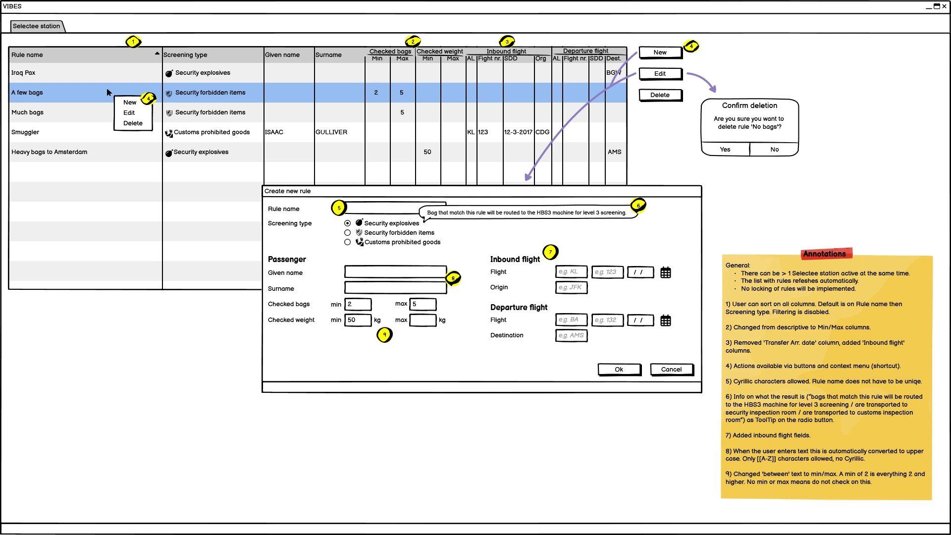
Mockups
One of the issues during development was that domain experts would sometimes come up with designs (made in Visio or PowerPoint) that were very hard to implement, because they contained building blocks that were not available as controls in WPF.
As I promoted doing prototyping with dedicated tools, we first settled on "Blend with SketchFlow". The advantage that Blend offered a control set to the designer that was based on what is available in WPF, solving that problem. The "SketchFlow" part of Blend offered low-fidelity prototyping with excellent interactivity parts and extensive functionality for creating and parsing remarks on mockups.
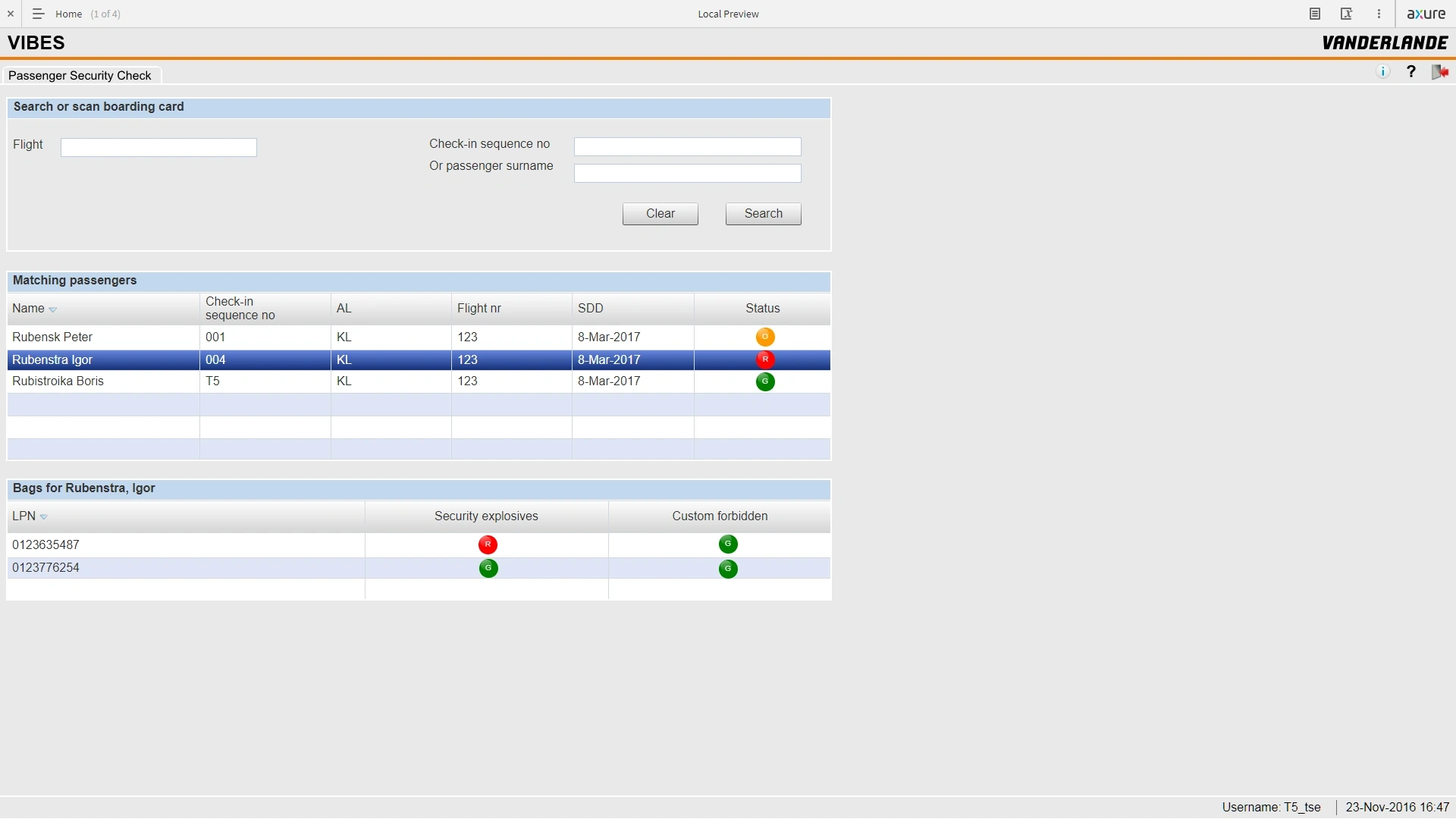
Later we switched to a mix of using Balsamiq for low-fidelity mockups, and Axure for high-fidelity prototyping.
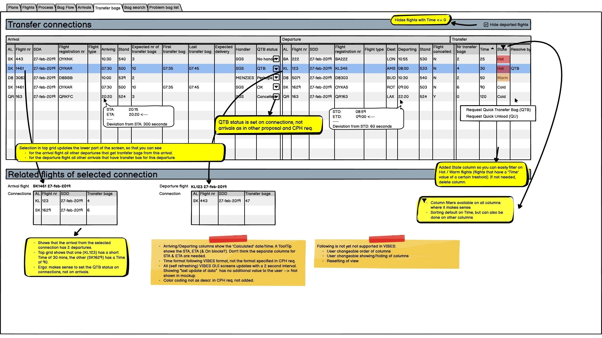
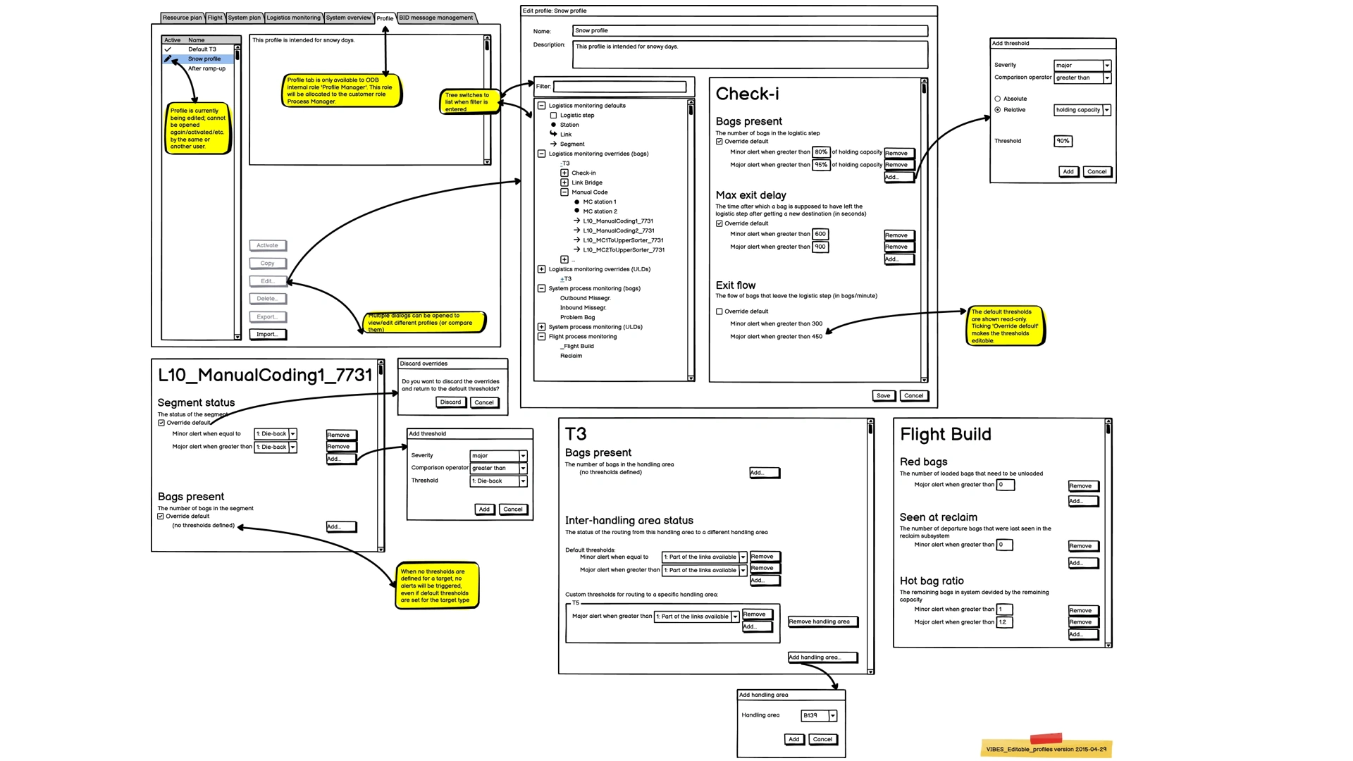
Using low-fidelity prototyping proved to be golden; I've made dozens of quick mockups which helped tremendously in discussions with stakeholders. "A picture is worth a thousand words" could not be more true. I would use the low-fidelity mockups firstly with internal stakeholders, like system architects, product owners or project leads, but have also used them with customers and end users. The concept as to 'why low-fi' is easy to explain and I had no resistance in using them.
Interactive prototyping
Where interactivity was required to explain a UI proposal, I used Axure. We got feedback from the London Heathrow Terminal 5 project for example that they sometimes missed important alerts because they were looking at other tabs on their multi-monitor setup. We had some talks about the problem and then designed a notification system with notifications popping up bottom-right of the primary screen before they moved to a notification side bar. We presented an interactive Axure prototype of this to the customer who was intrigued and so enthusiast that he asked for the prototype to show to his other collegues afterwards. Within a week, the customer supplied budget to implement it, a record short time!
This was a just bit of fun; to show what you can do with interactivity in Axure prototypes, I made one in which you can log in (incl. validation on the fields), a loading screen, switchable light/dark theme, working clock, logout, etc. I used it to jokingly fool a product manager into believing I was now running the real BCR GUI (a Windows desktop application) in a browser. It worked 😁.
Styleguides
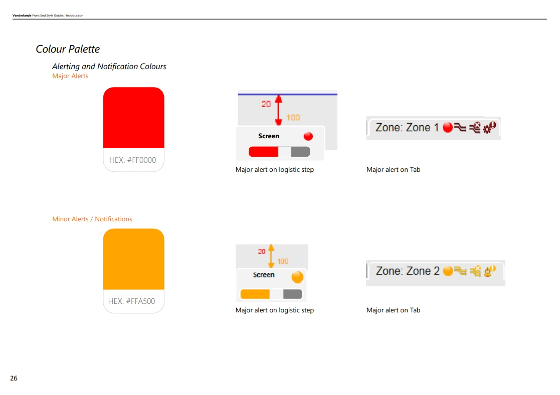
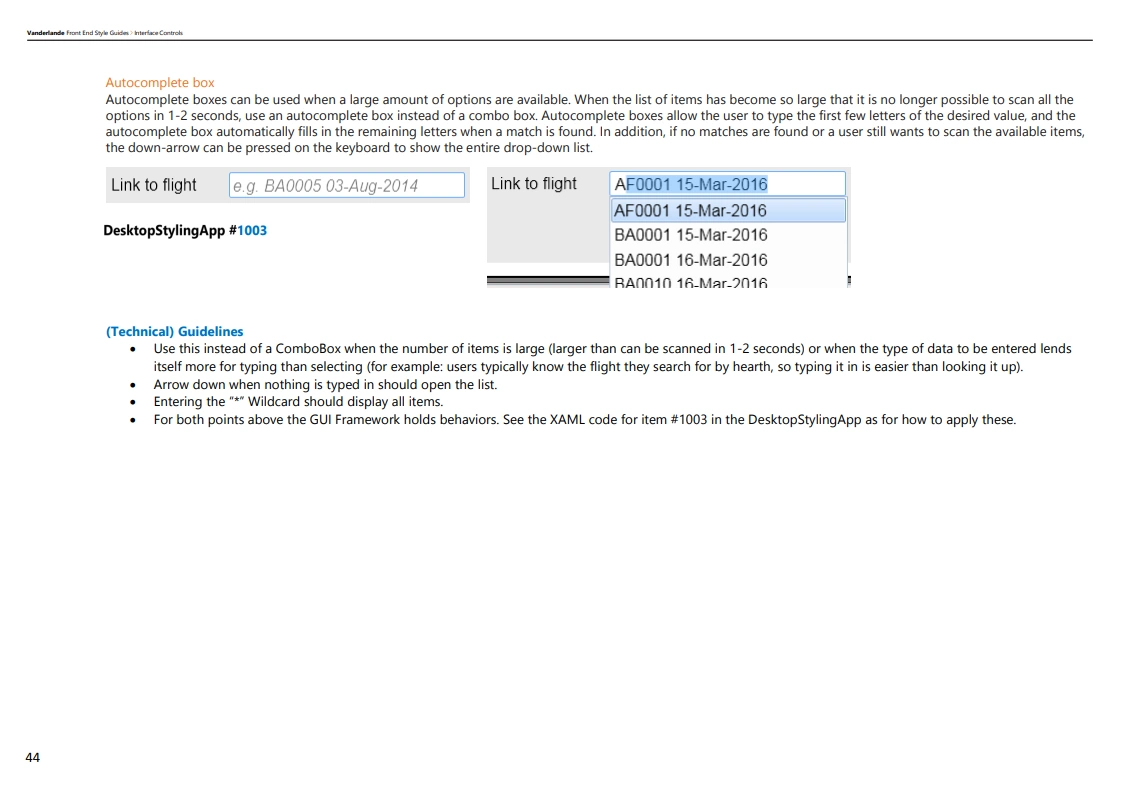
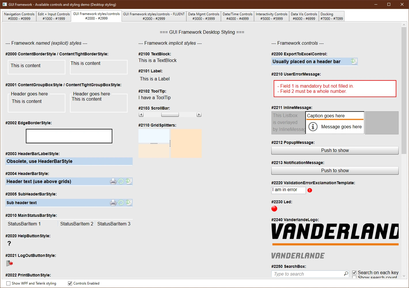
When the first full-time UX'er was finally hired, we teamed up. We wrote a style guide with the aim of getting more consistency in the UI parts made by the different teams. To accompany it; I developed a demo application that showed all available styles in a live environment.
Process
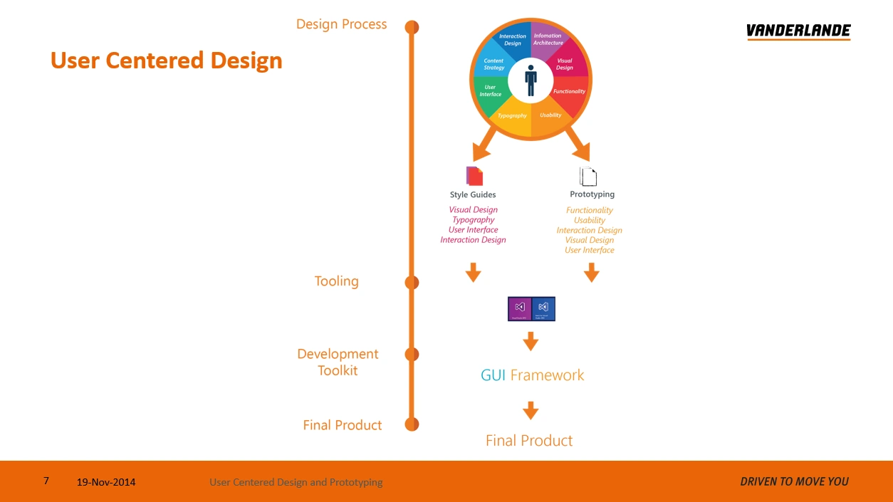
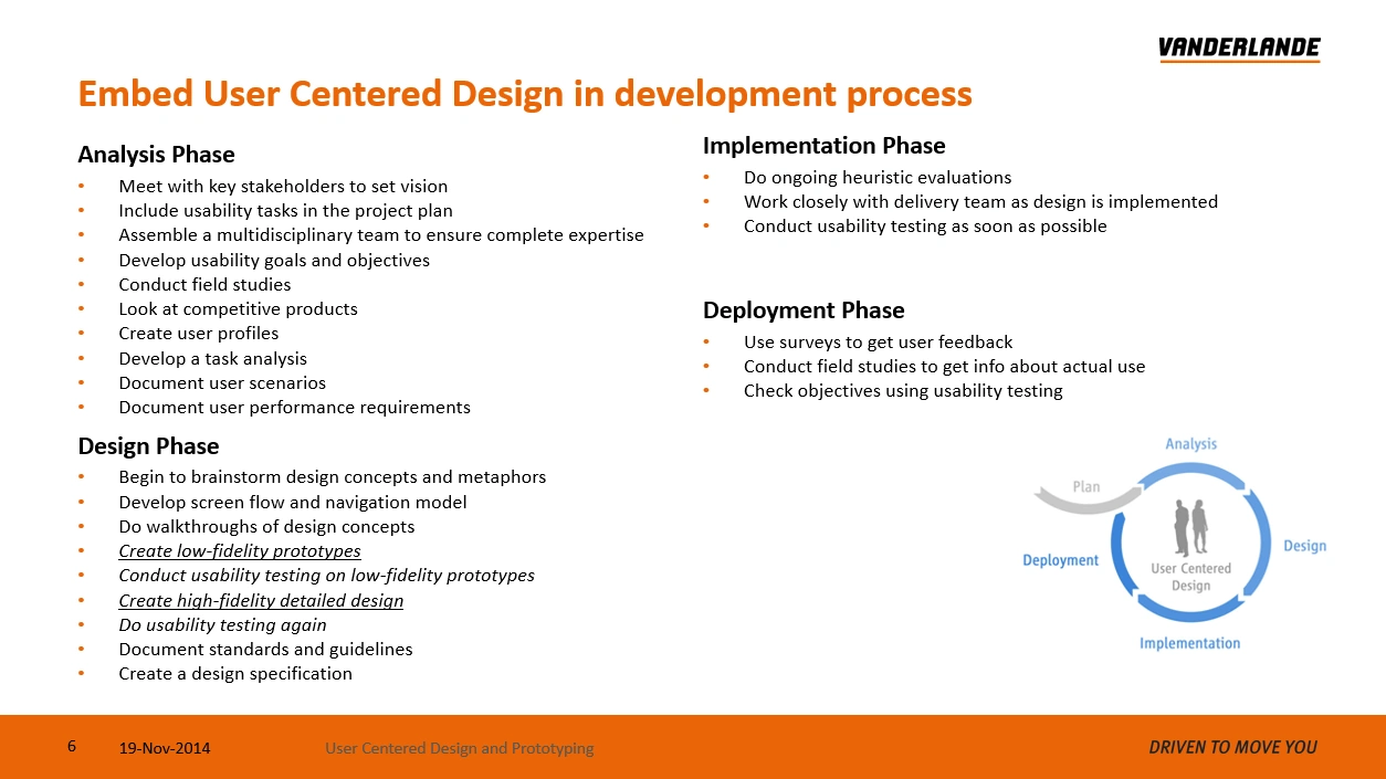
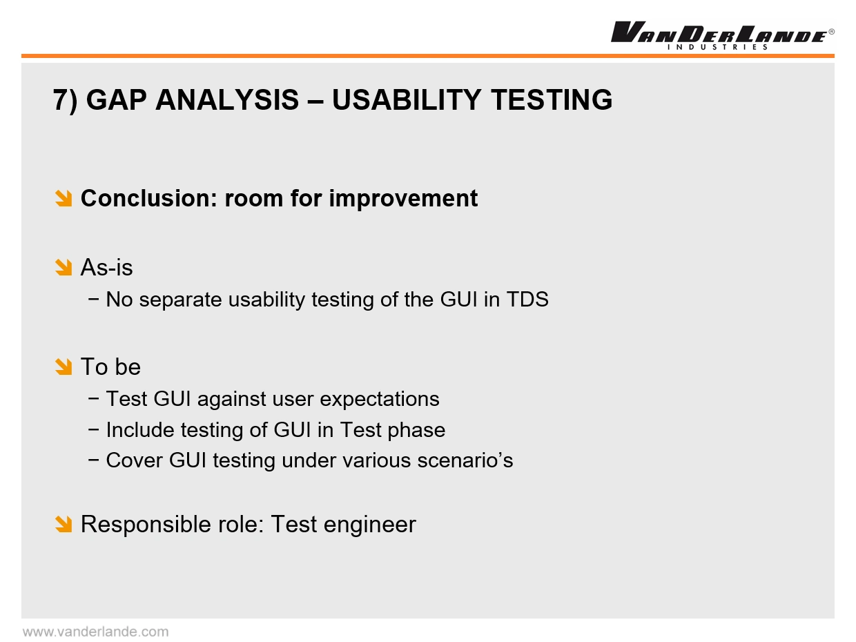
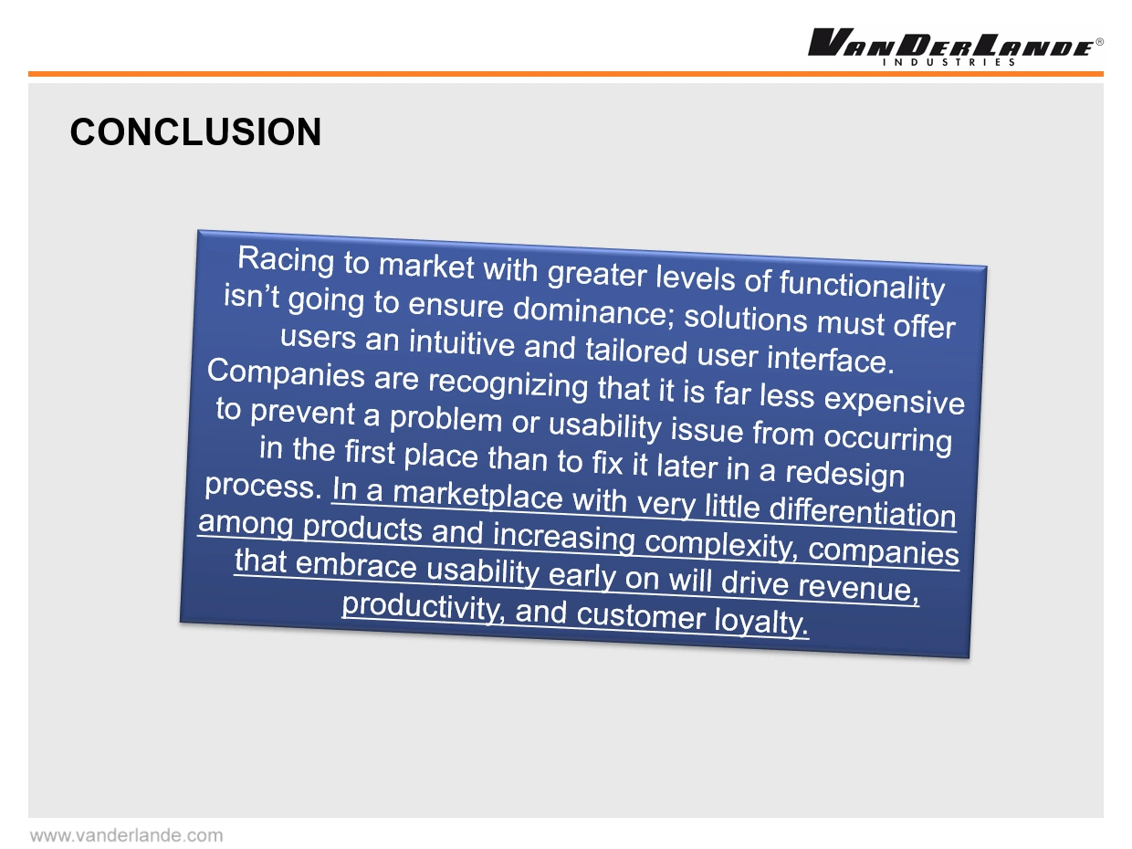
I've campaigned to get UX more focus on the importance of UX. I held -sometimes with fellow UX enthousiast- quite a few presentations to various (management) levels to introduce User Centered Design and concepts as wireframing, prototyping, site visists to do interviews and observations, user testing, etc. to Vanderlande. All were met with enthousiams and agreement, sometimes even to the point where we agreed to follow the UCD process or introduce an UX role to each project. In practice however, there was always a high-presure new project around the corner which required all focus on development activities. Even so, throughout my time at the airports department, UX awereness grew, an undercover UX group finally formed within another department and finally a UX department was established. I like to think my activities helped somewhat in that process!
Product
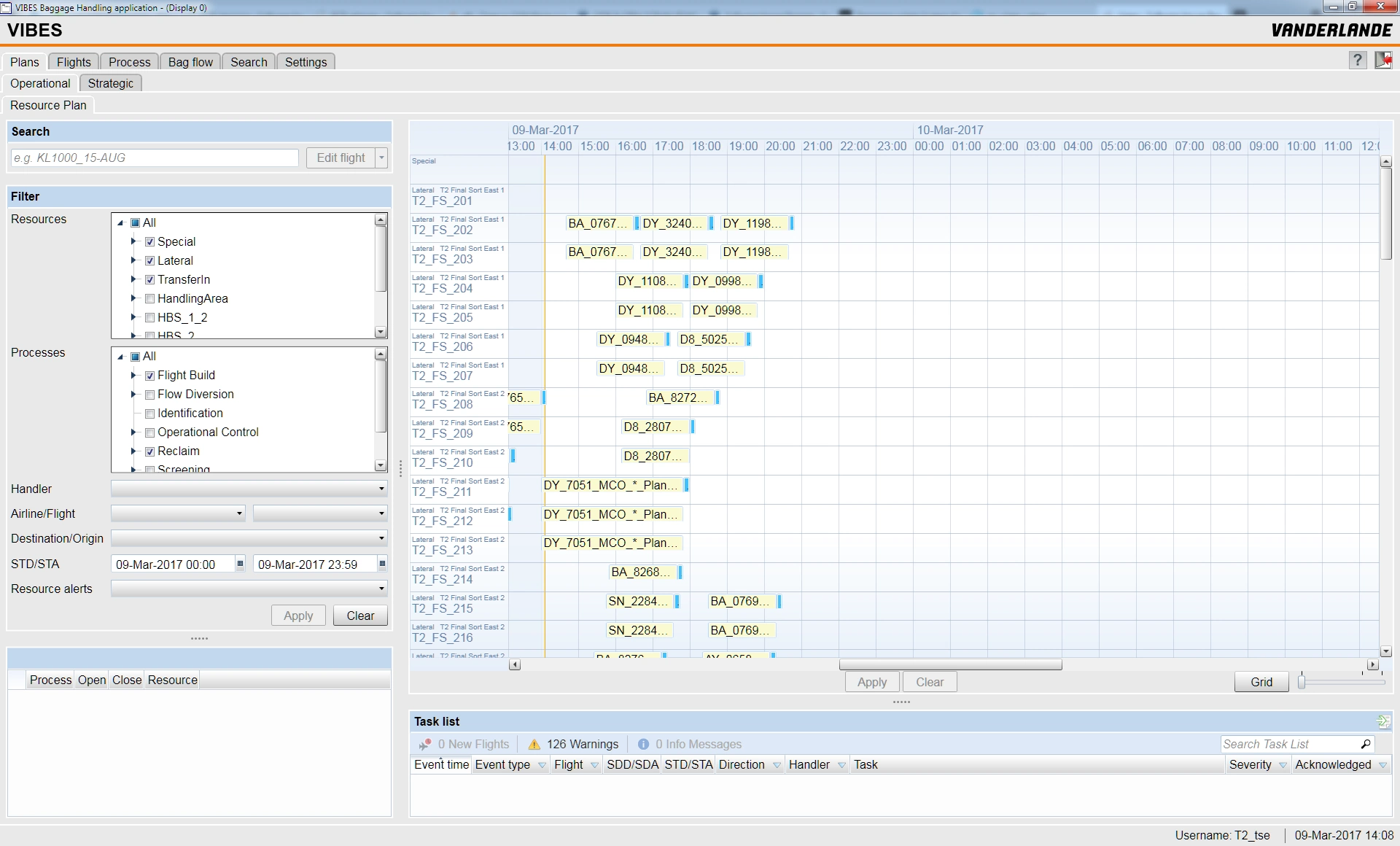
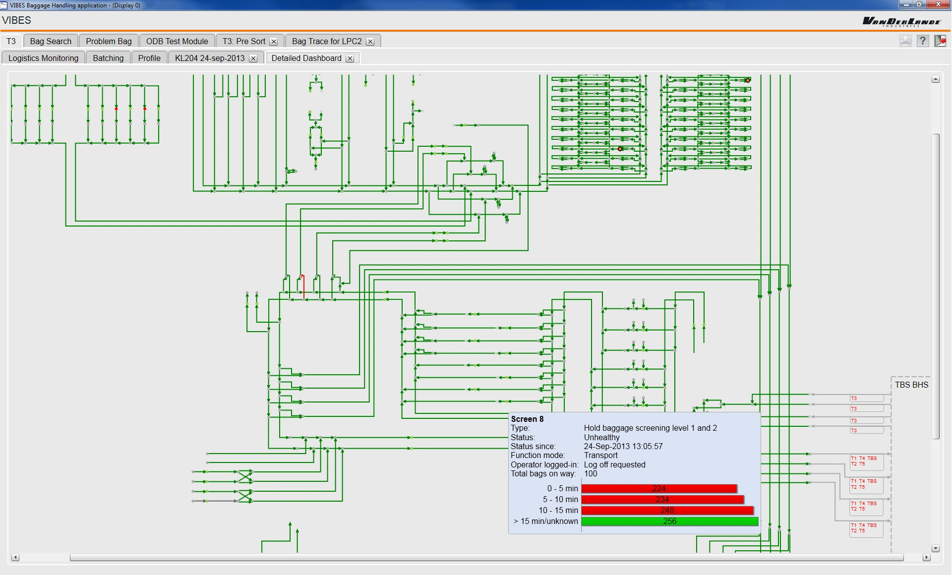
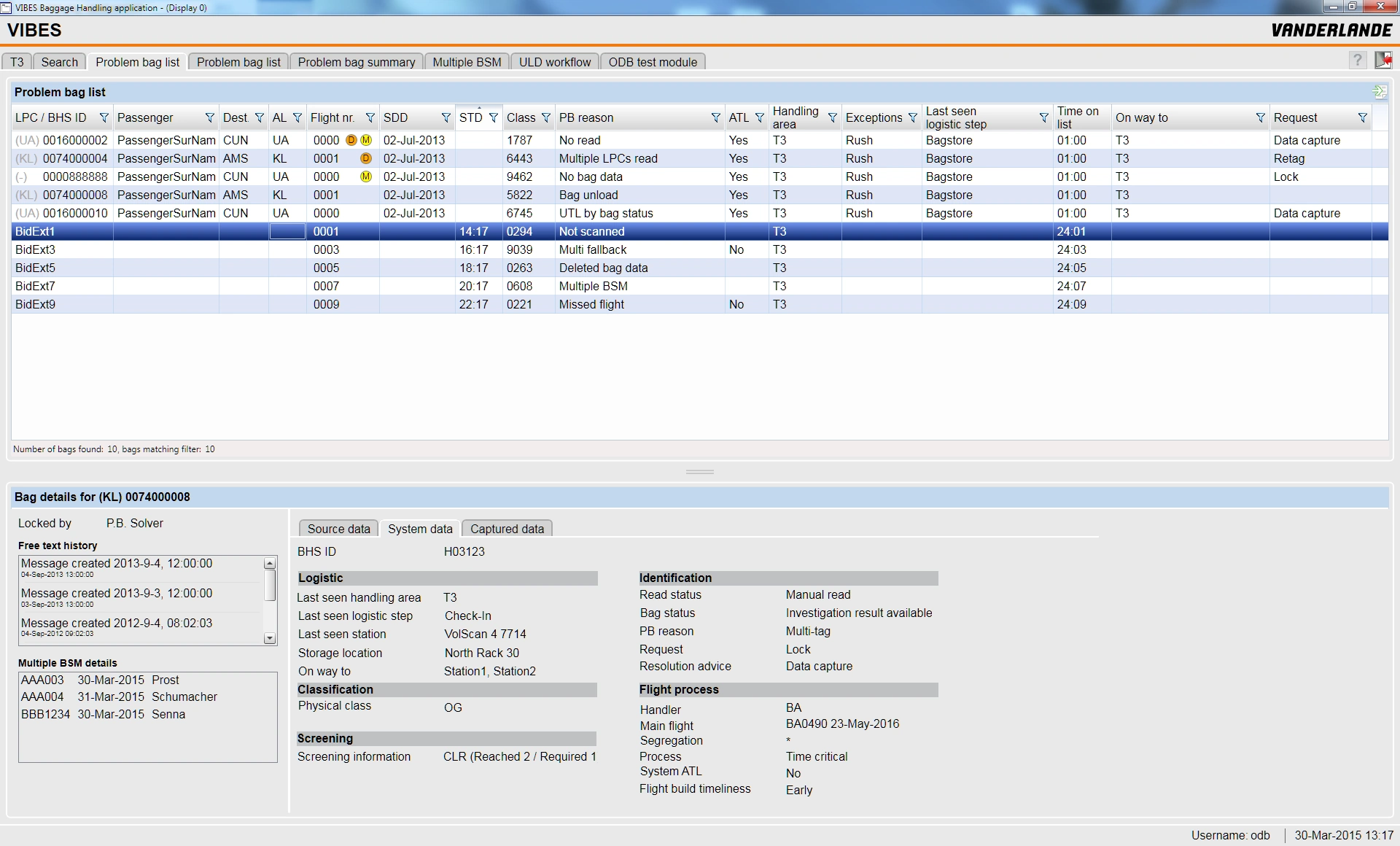
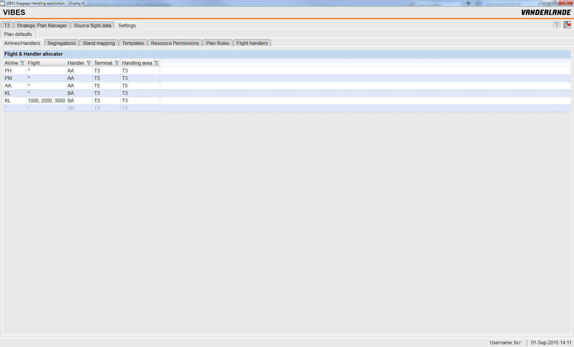
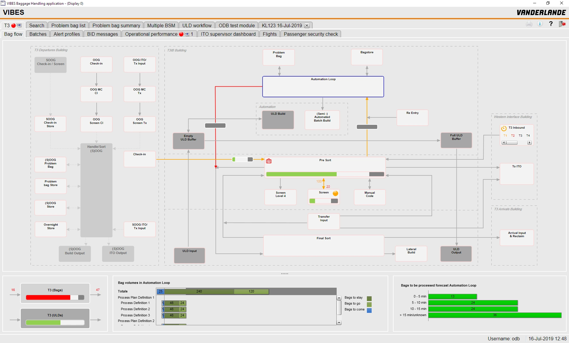
The BCR GUI evolved and grew considerably during its lifetime. Here are some screenshots (for a version with an updated UI design, see the next project).
Result and Takeaway
Airports and baggage handling is a serious, industrial business. Project contract and requirements phases can take years, building software for projects easily multiples years. Once up and running, airports do anything to minimize the risk of down-time. Upgrades to software have to be thoroughly tested, from delivering an update to having it actually deployed can take months. It is a conservative area where the latest design trends and frequent updates matter less.
I have been on the project for a long time and fulfilled many different roles, from front-end developer to UX advocate to product owner of the underlying GUI Framework. It was tremendously satisfying to see the BCR GUI grow to a mature product being deployed on airports all over the world.
A learning point for me has been to stand for my vision and break free from soley doing what is expected: as the pressure was always high to deliver software in time for yet another airport project release, I and often slid back into a developer role to be able to help meet those deadlines. Doing so certainly helped Vanderlande and those projects on short term, but I missed out on joining new UX initiatives as the company matured on that.
Nevertheless, it has been a great journey and I am proud to have been part of it. If you fly frequently, chances are the journey of your suitcase within an airport has been planned and monitored on one of the screens I made!
