updating the UI design of the
Baggage Control Room GUI
Summary
Updating the UI design of the GUI for a Baggage Control Room so it looked fresh and modern and could be sold for a few more years until the successor was ready
| My Role | UI Designer | UI Developer | |
| Aim | To update the BCR GUI to a modern look | |
| Challenge | Updating each and every single control of a huge GUI in a short time | |
| Start | 2018 | |
| Duration | 3 months | |
| What I did | Arrange budget, UI Design and Development | |
| Tools |
The story
Baggage handling operations at airports are overseen from a Baggage Control Room, often overlooking the baggage handling system. Vanderlande developed a Baggage Control Room GUI for its VIBES Baggage Handling System in 2010. This BCR GUI was rather technical of nature and developed without big emphasis on UX or UI design. Nevertheless, it was a great success and used in airports all over the world, ranging from small (i.e. Eindhoven size) to very big and complex (i.e. Heathrow, Istanbul).
The problem
Around 2018, development of a new generation of this GUI started with a heavy focus on UX. It was not expected to hit the market for a few more years. Meanwhile, the current BCR GUI -while being an excellent work horse- started to look really outdated.
Vanderlande had become one of the world leaders in baggage handling systems with is advanced VIBES system, but the look and feel of the user interfaces no longer suited this market leading role.
The project
Being one of the lead developers and designers of the BCR GUI, I've campaigned hard within the company to get budget for a UI redesign to bridge the gap until the next generation UI was released. And I succeeded; a demo of a few updated screens convinced management to allocate a budget of about 3 months for an updated look.
The entire BCR GUI by then had been developed over a period of 10 years, by 2 separate (later merged) scrum teams. On average, 3-4 front end developers worked on it during this period, so one could say 30–40 man years of development effort was spend on the UI alone. To re-work a UI of this size, solo, in 3 months, some pragmatic choices had to be made.
The process
The BCR GUI was built in C#, WPF and used Telerik controls with custom styling. But often also with heavily modified control templates (in WPF, you can completely change the parts of a control; we for example heavily changed templates of an Outlook calendar appointment type control to make it into a flight planning control).
I used this approach:
- Leaning on a Telerik 'Fluent' theme and inspired by the new Microsoft Windows Fluent styling, I designed a new visual identity for the controls in both a light and dark variant.
- I updated all our custom styles to be in-line with those styles.
- Then it was a matter of patiently and cautiously examining every control template that was modified during the development period of the BCR GUI, analyze the modifications, and craft a new template with the 'fluent' looks applying the same modifications.
An example of an updated screen, a 'flight build progress' tab, left side in the Classic style, right in the new Fluent style:
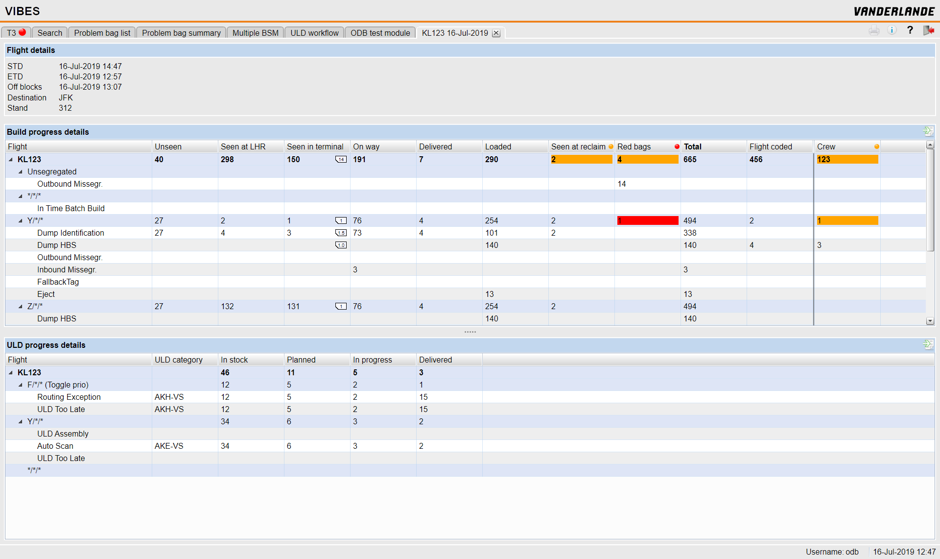
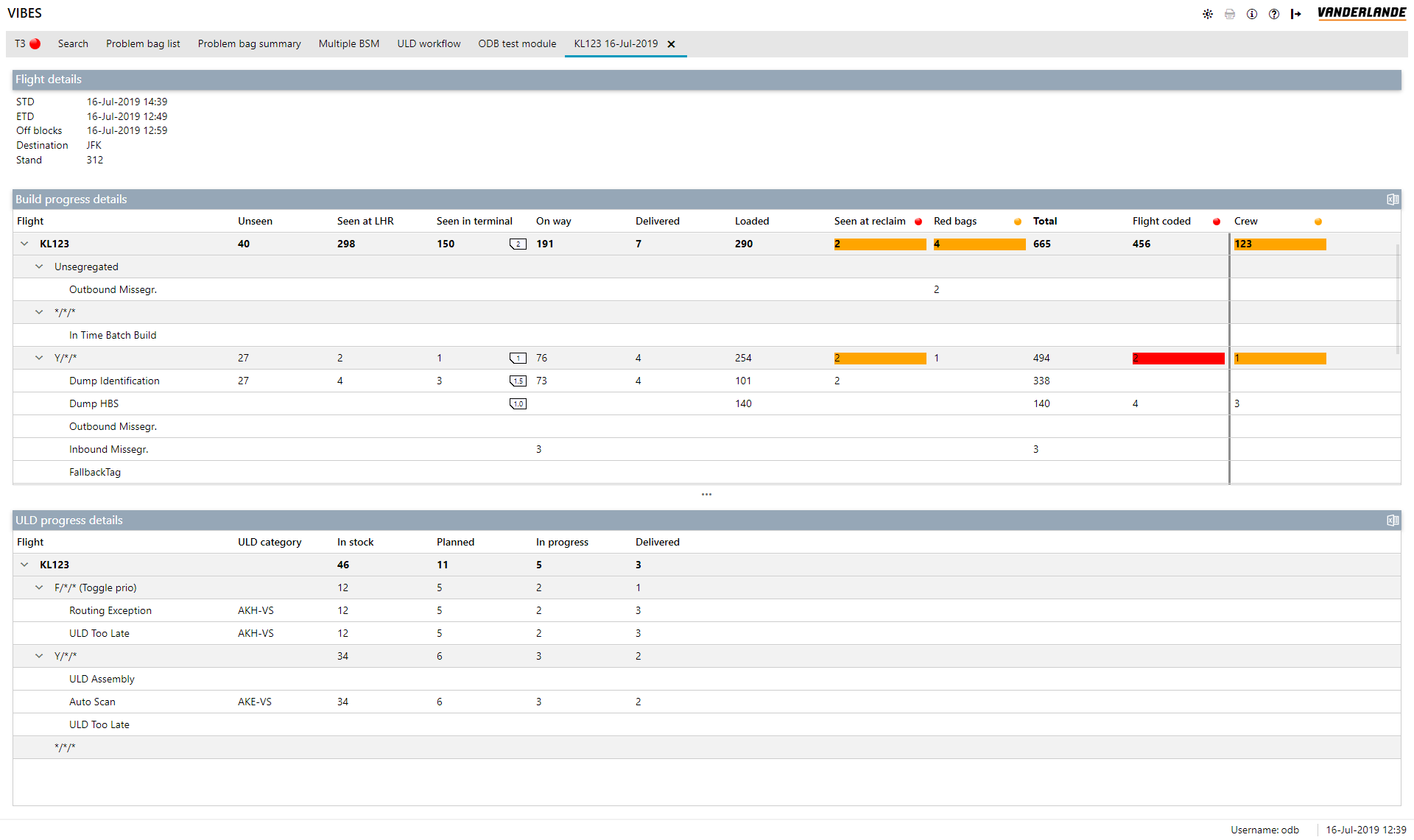
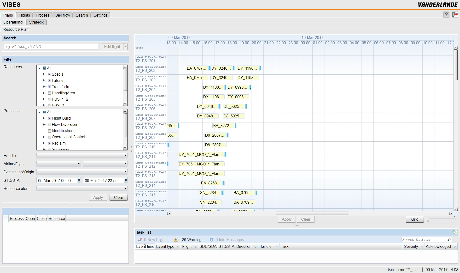
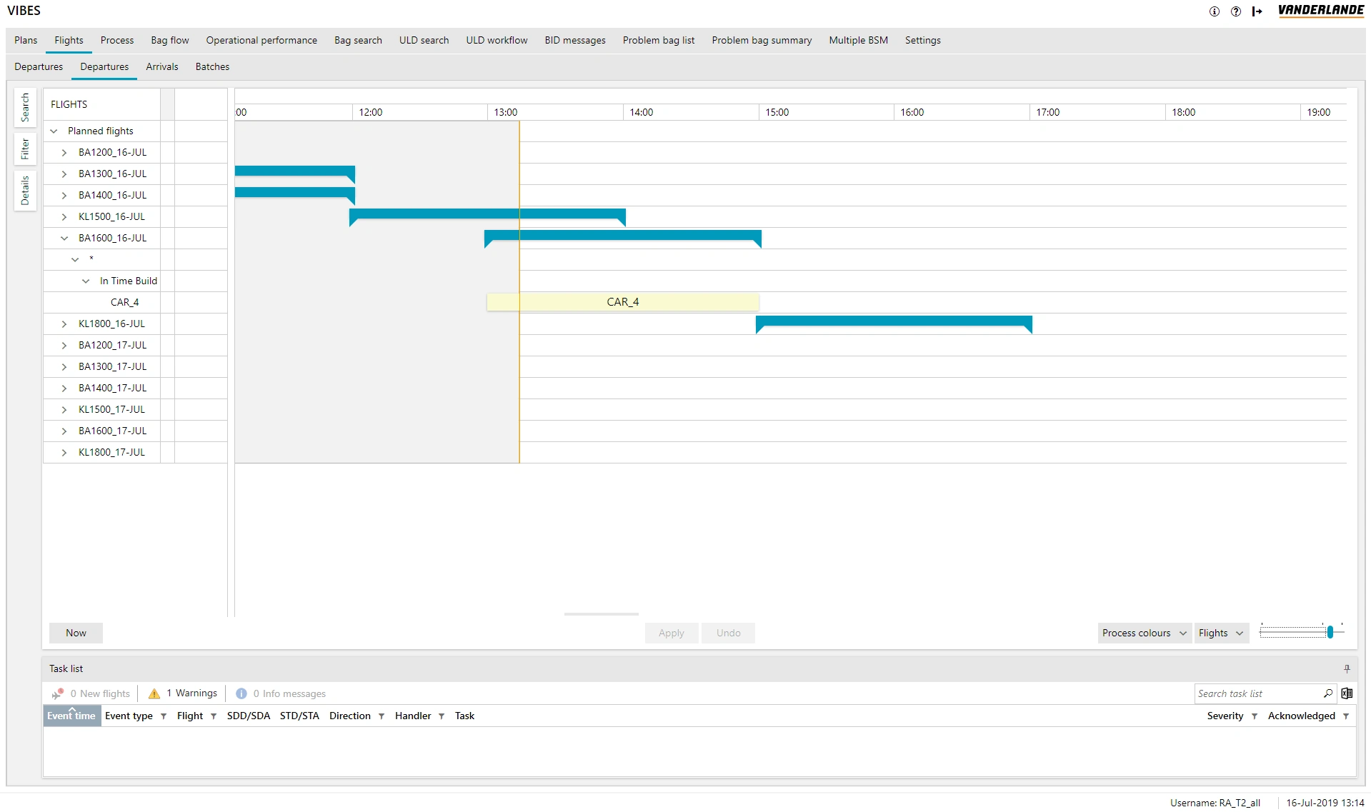
The new 'Fluent' theme co-exists with the 'Classic' theme; some airports that have been in operation for a while might not want to switch to the new theme because they don't want to update training materials, etc.
Planning in Classic and Fluent variants:
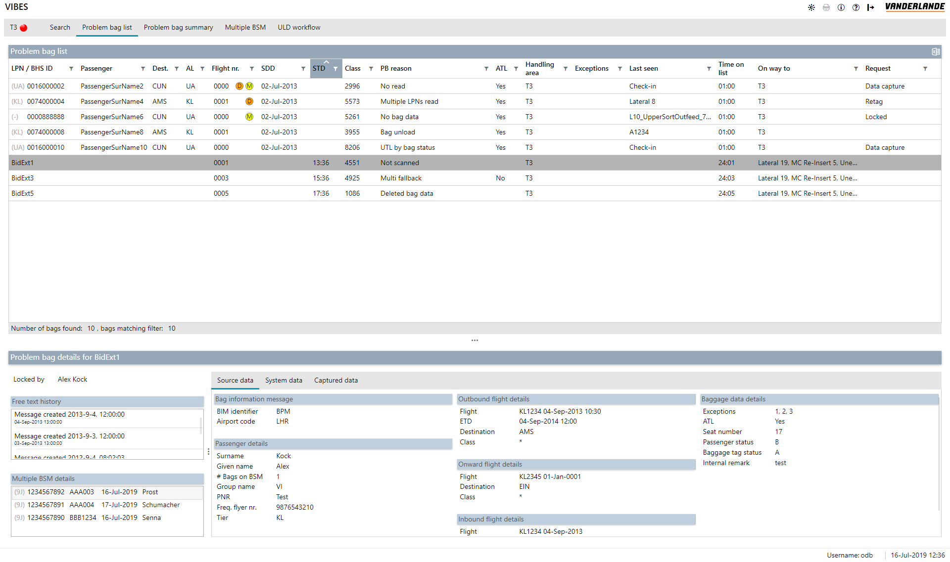
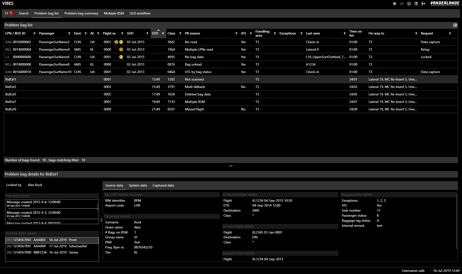
The new theme also comes in a live-switchable light and dark variant. I've added a button to the redesigned button area on the top of the screen that allows the user to toggle between a light and dark mode.
Fluent light vs dark mode:
Result and Takeaway
The BCR GUI is a huge one. As stated, one could estimate it has been 30-40 man years of development. To re-work that entire GUI on my own, with most of the original developers no longer available, in 3 months to a new light and dark theme was a challenge! But certainly, an effort that paid off. The GUI looks a lot cleaner and modern, and the changes were received very enthusiastically both in the company and by customers. All new projects use the new fluent theme and the BCR GUI can solder on for years to come, awaiting the arrival of an entirely new generation, called VIBES-UX.
